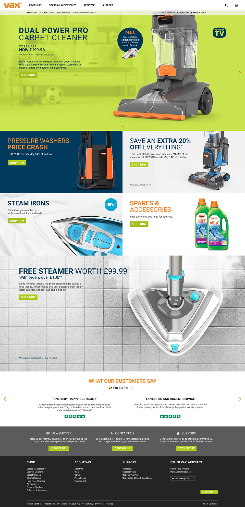
Vax Home Page
Client
Vax
Description
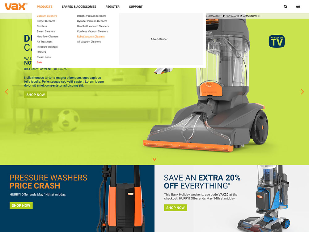
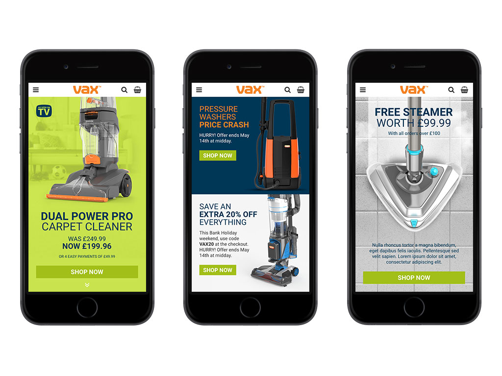
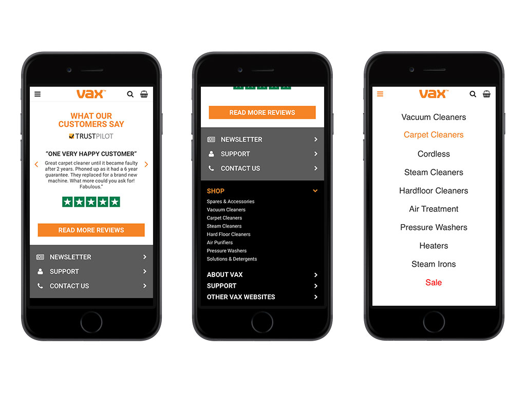
Concerned that the current homepage wasn't as effective or impactful as it could be, Vax asked me to come up with an alternative design that was not only fully-responsivee but also made better use of the huge amounts of real estate offered by large format screens that are becoming more popular these days. My designs also offered an alternative approach to structuring the navigation and, therefore, the sitemap, as the Vax product range would soon be growing.
Skills
- UI Design
- UX Design
- Wireframing
Artwork


