RAC Home Page
Client
RAC
Description
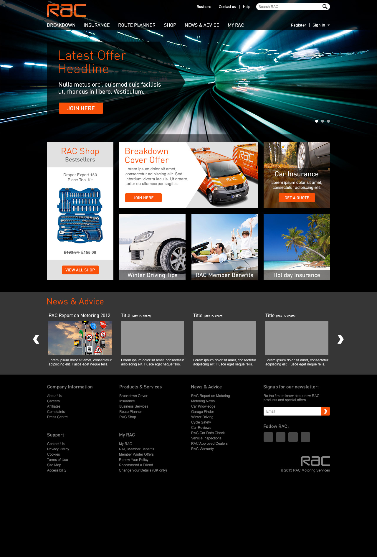
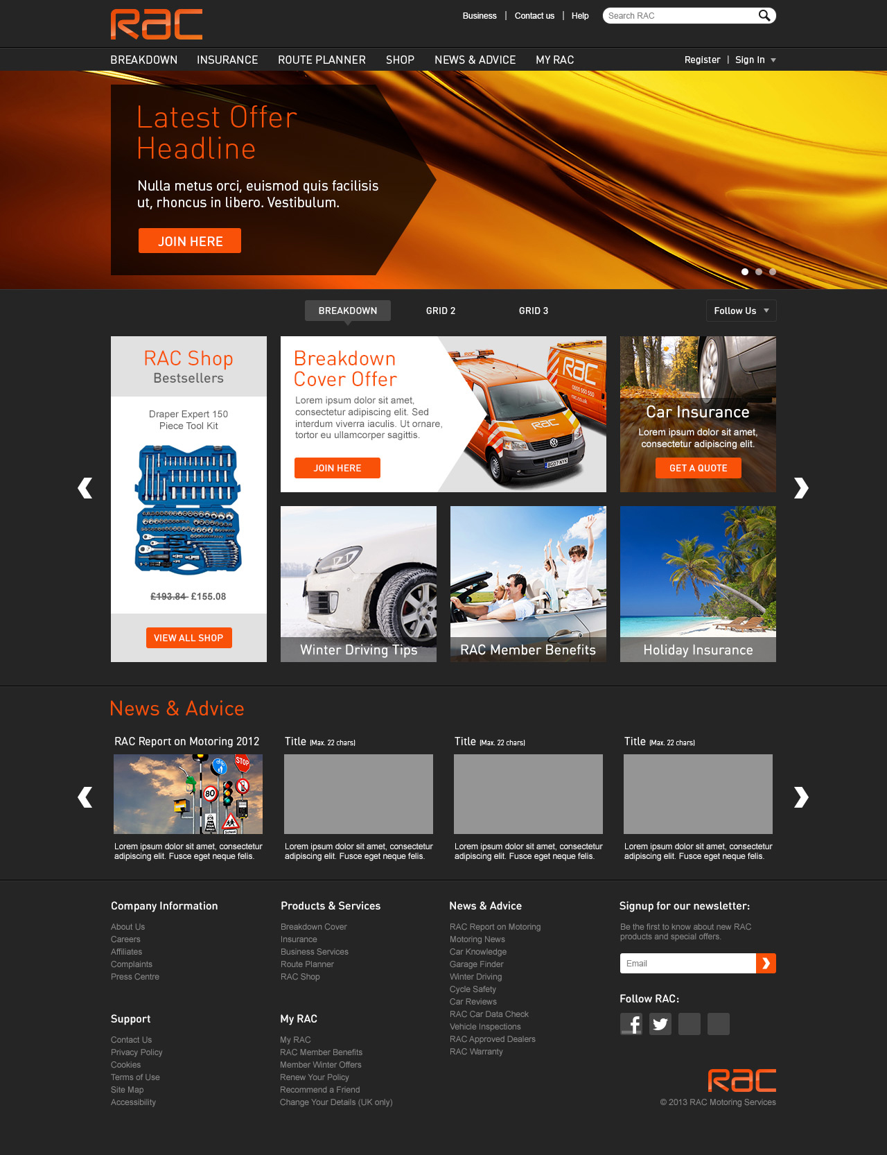
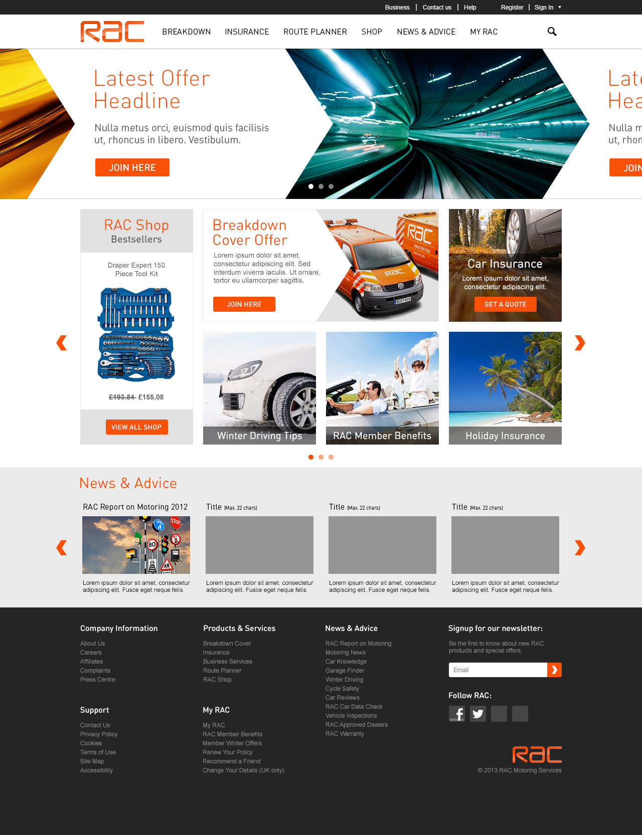
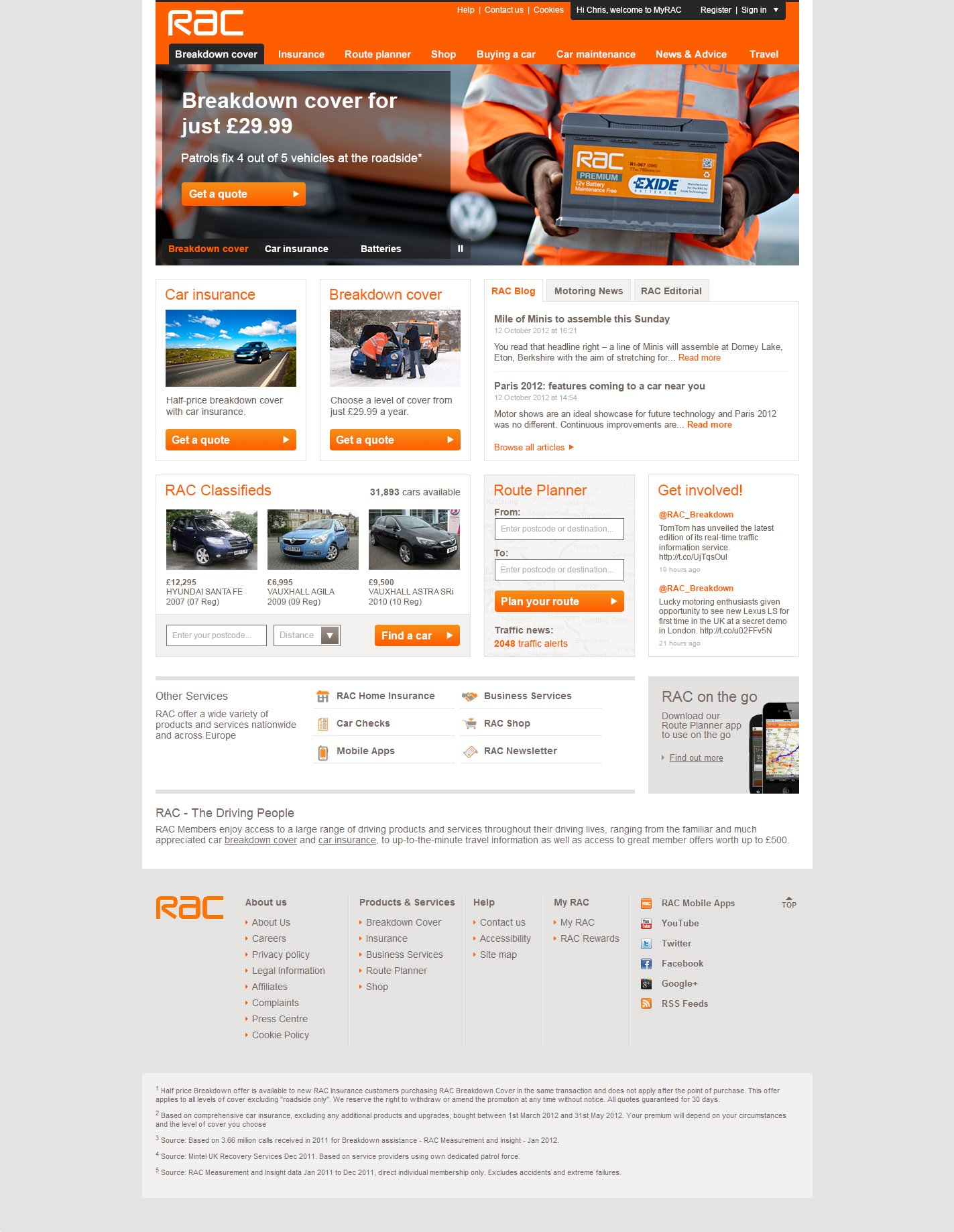
The RAC updated their brand guidelines in 2013 and it was my job to reflect this change in thier large UK customer-facing website. The ideal starting point was the homepage which went from being drab and text-heavy to sleek, eye-catching and concise.
Skills
- Wireframing
- UX Design
- UI Design
Artwork


